harry bertoia poster
Poster | Visual Composition | Typography
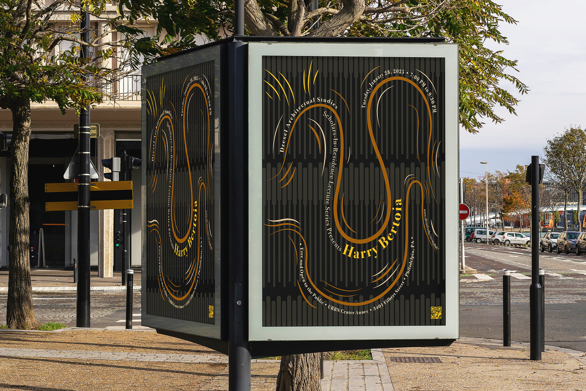
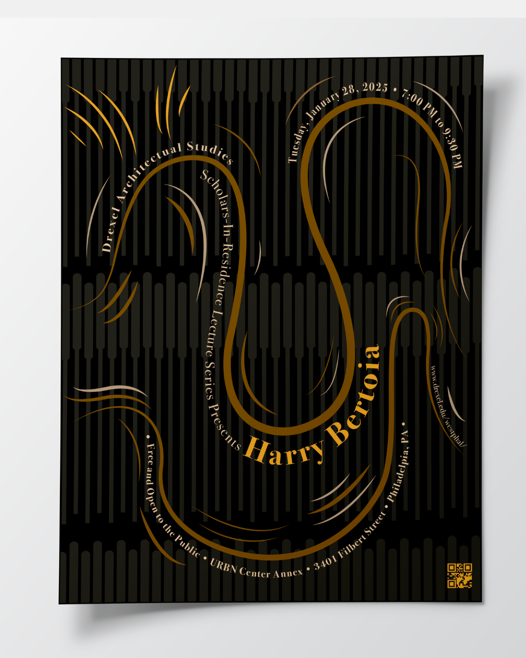
For this project, we were tasked with creating an exhibition poster for an architect or artist. After extensive research on our artist, Harry Bertoia, I wanted my design to represent his sound sculptures, so I tried to recreate their sound patterns and movement with line. The design started with many sound waves in different directions, in bright brass oranges like the colors of the sculptures. It then changed as I reduced the number of lines for a “less is more” approach to the poster. I also changed the positioning of the text and shifted the color palette to more muted brass and bronze tones, which accentuate the text and keep the composition from feeling overwhelming. The design then evolved into illustrating the actual structure of a sculpture in the background to allude to his architectural work.
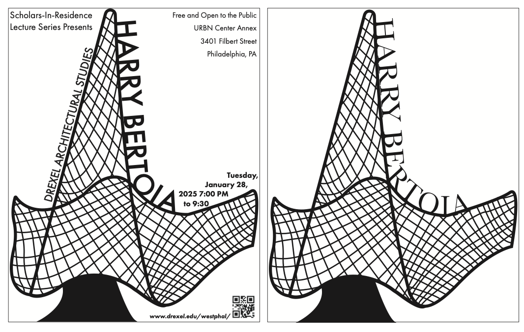
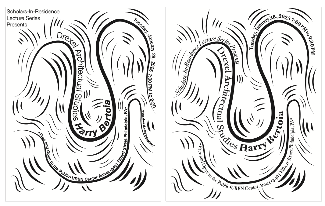
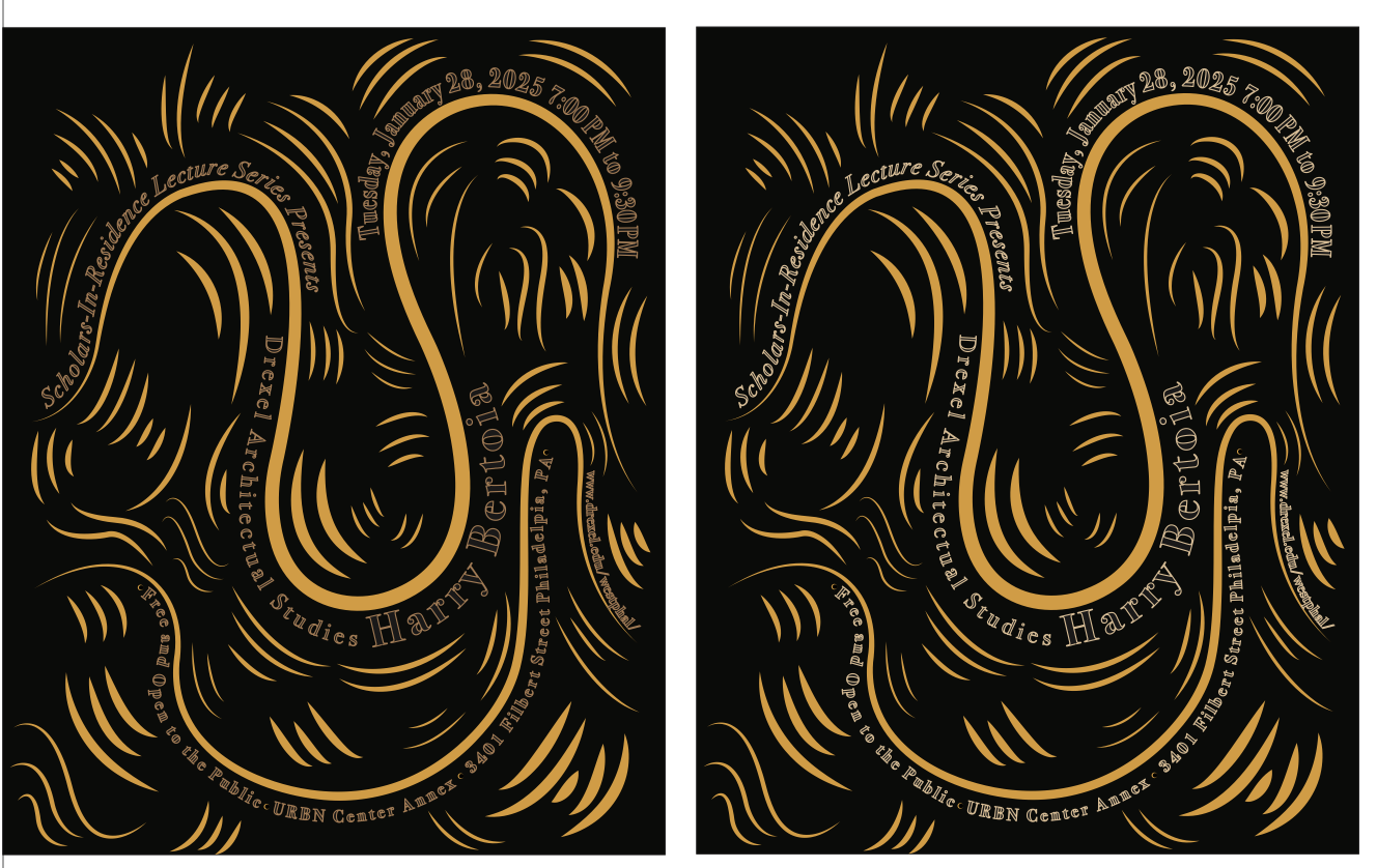
Work In Progress and Concept Work