Fringe festival poster series
Poster | Typography | Scanning
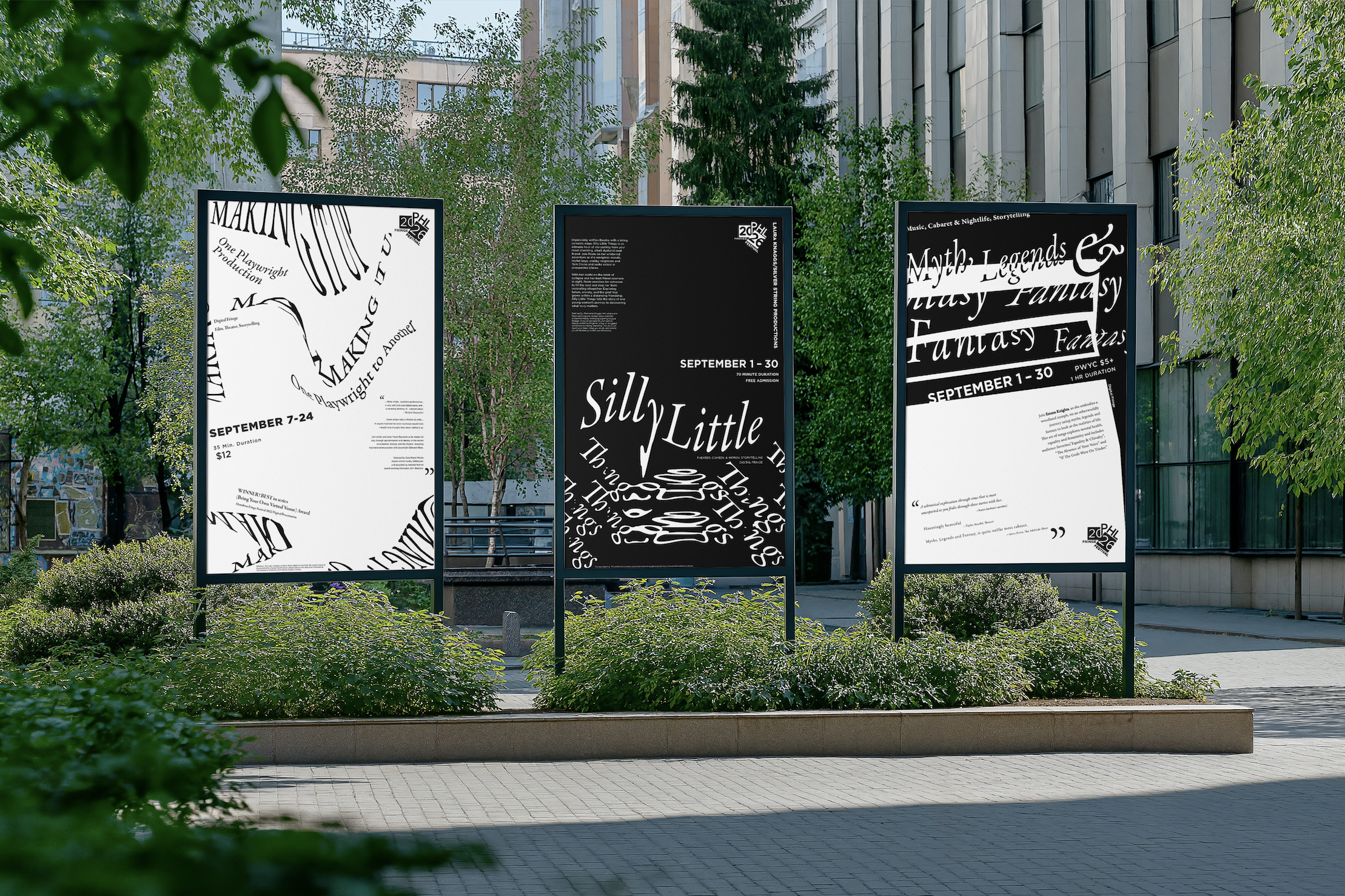
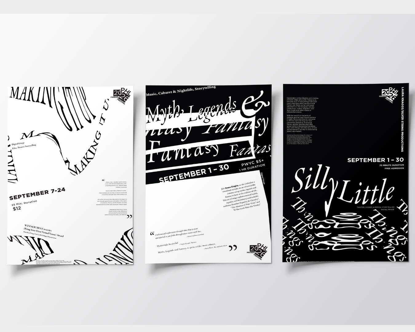
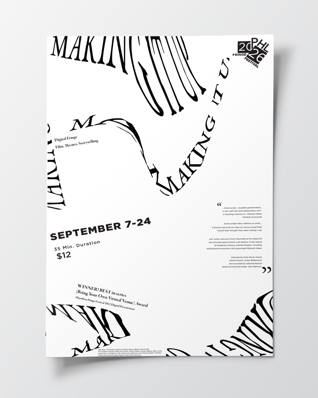
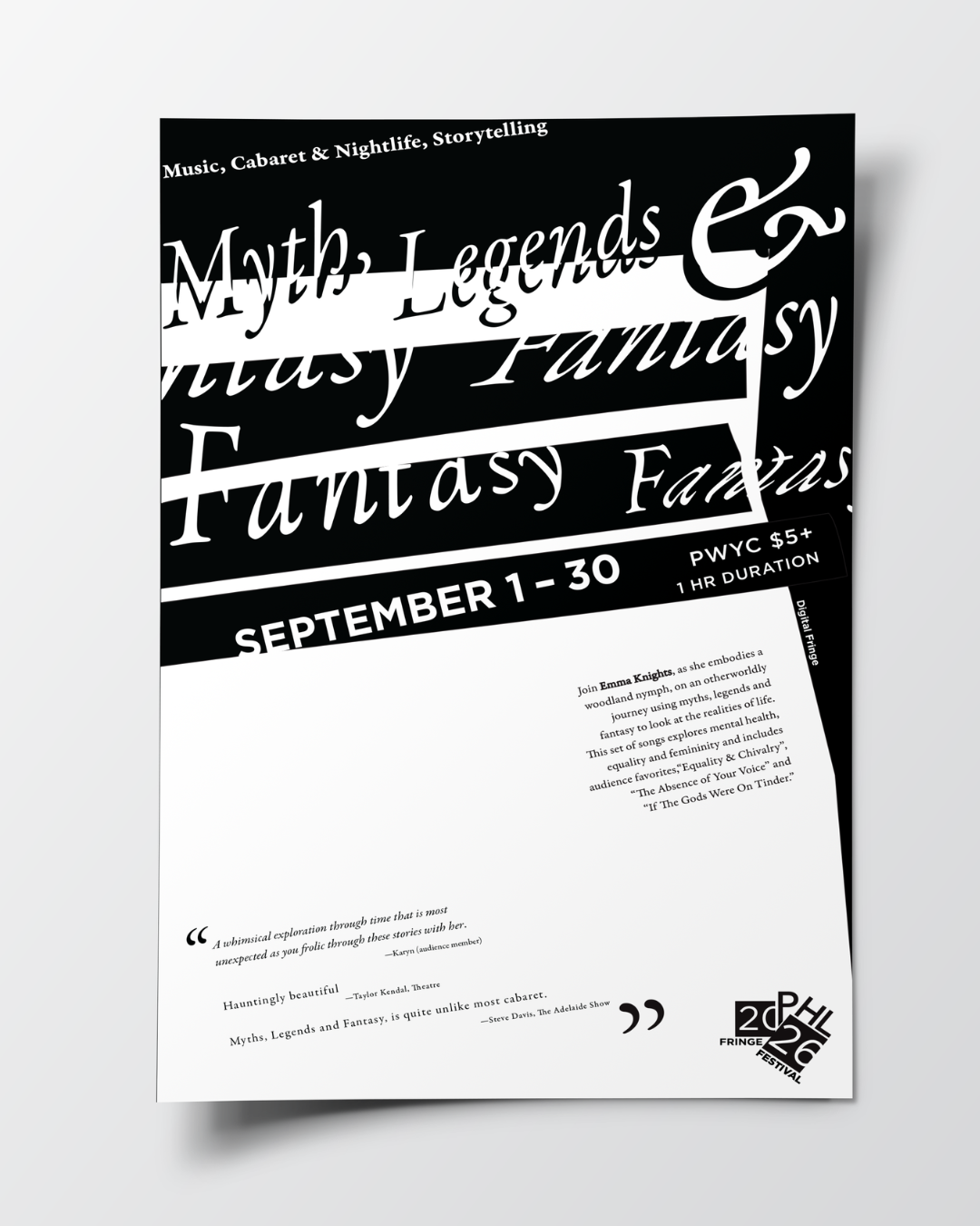
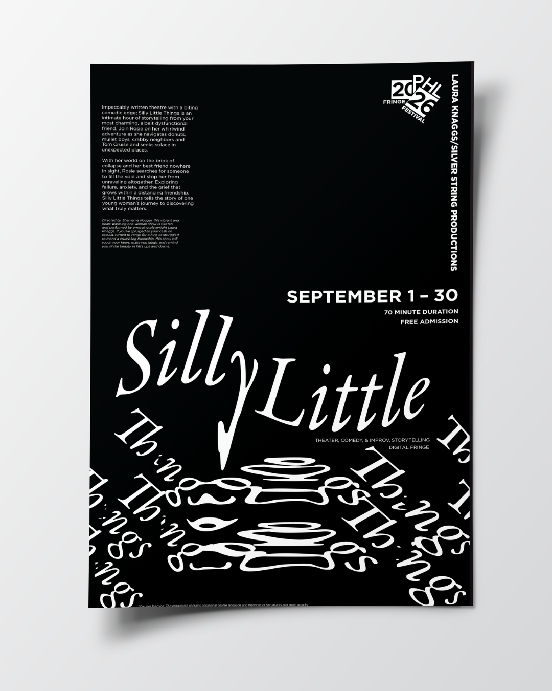
In Typography II, we were assigned to expand our knowledge and capabilities with type by creating a poster series that uses type as the main visual. We were given three different exhibitions or events that took place at the 2026 Fringe Festival, and we also had to design a logo to be used exclusively across all of the posters. I used a copier and scanner to accentuate the type and build a captivating composition. This was an exercise in placement and structure. I worked to keep the posters connected through their typography and style, and I made one poster white, one black, and one a mix of both to tie them together as a trio. I used Photoshop and Illustrator for this process.